Making a website is easier than ever. Squarespace, WordPress, Wix and Weebly have empowered small businesses to create exceptional digital spaces for little to no money, an unthinkable advancement from the days when personal sites were restricted to Angelfire and Geocities.
Now, even if you have no graphic or web design skills, you can buy a theme that’s basically ready-made out of the box.
But therein lies the problem for small business owners. Even if you have free tools and awesome templates – you’re probably not a web designer. And you might not want to shell out the cash to hire one. So, with little to no experience, how do you create a unique digital presence that gets noticed in a sea of out-of-the-box design?
We’ve combed the web and found four stellar small business websites you can learn from – along with some commentary on what makes them great and advice on how to create them (or something like them) with small business skills and a small business budget.

Moving Waldo
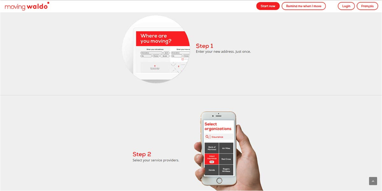
What is it? If you’re moving soon, you’re probably dreading having to change your address repeatedly: at the bank, at school, where you work, with the government, on invoice templates and credit cards and everywhere else. Moving Waldo is a brilliant Canadian service that’s partnered with thousands of institutions—you tell Waldo where you’re moving, and they alert the relevant places.
Why is their website great? Just scroll through the simple three-step process outlined on their homepage and you’ll find yourself understanding the concept literally within seconds. It speaks to the entire philosophy behind the company: simplify life.
How can you create something similar on a budget? Certain elements work because of aesthetic consistency. Every image is round and soothing—the button, form-entry fields, even the font and logo. There are no hard edges, no rectangles (not even the thought of moving boxes enters your mind), and that kind of design mindset doesn’t cost anything. The website’s simplicity, too, is its entire pitch. When designing your own small business website, consider what emotion you want to convey and how that might translate visually.

SafeTrek
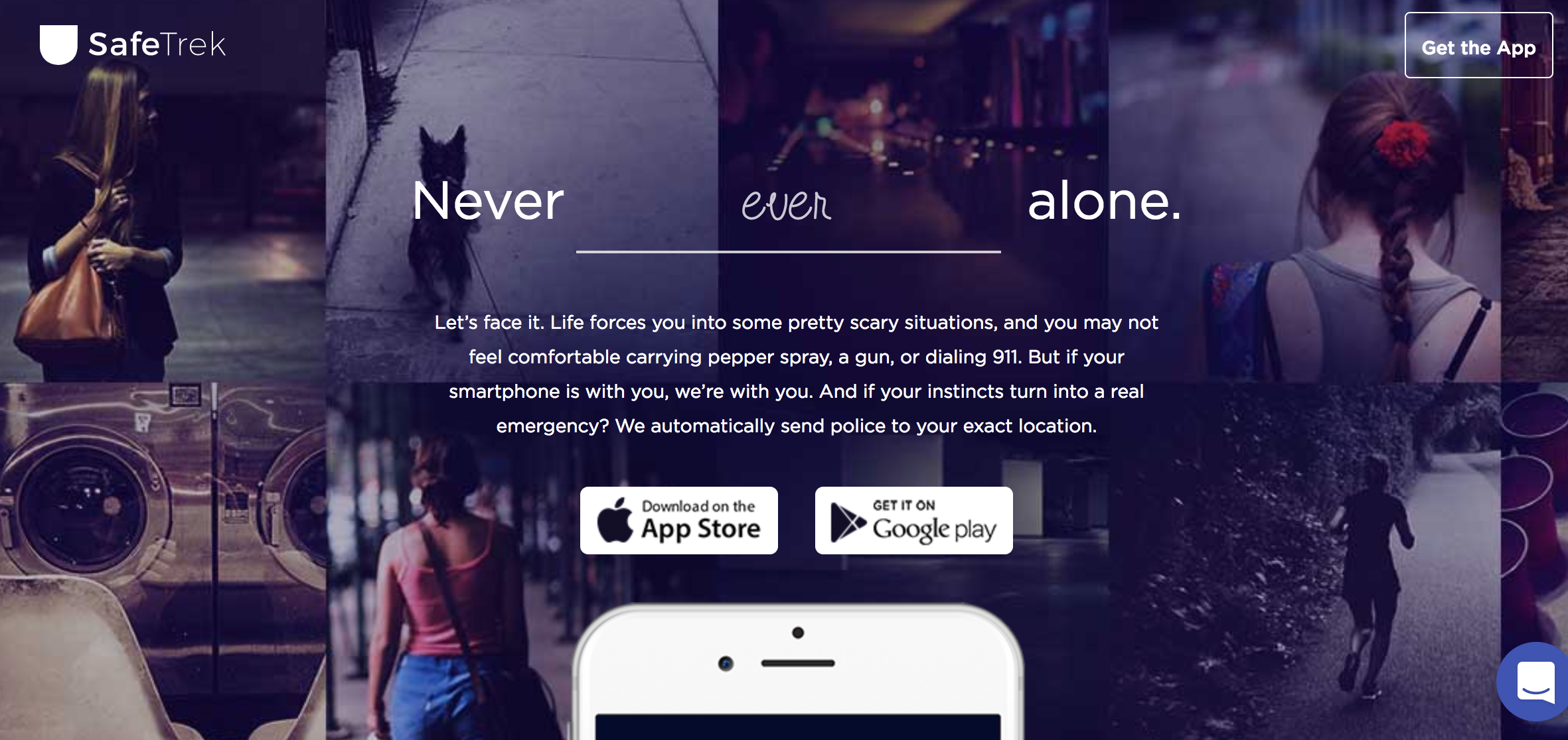
What is it? SafeTrek is a mobile app that allows you to protect yourself in unsafe situations. Originally designed by college students for college campuses, the app is now widely used by companies concerned about the safety of their employees as well.
Why is their website great? Mostly it’s the copywriting, since the site itself doesn’t actually allow you to test the app. But that in itself tells you something: good copywriting can elevate any web design, whether it be for a B2C SaaS product, agency or other B2B small business. The website speaks to the emotions people feel when imagining unsafe situations and makes a strong case for its worth.
How can you create something similar on a budget? If you’re confident in your copywriting, you’re set. If not, depending on your business, you can get away with hiring an affordable copywriter for a bit of work and test out different templates until you find one that works.

BitLocation
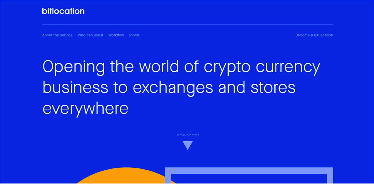
What is it? The goal here is to help everyday companies transition to accepting Bitcoin alongside standard currencies. It geolocates your device, tells you how many Bitcoin-friendly locations there are near you, and pitches the idea of accepting them in this strikingly minimalist website.
Why is their website great? Huge blue font on a white background? Totally mobile-friendly? All the information you need, without any obtrusive clicks? This thing is ageless web design. There are only three colors on the entire page—blue, white and orange—used in different ways, shapes and shades. If that’s not making something from nothing, I don’t know what is.
How can you create something similar on a budget? This website is deceptively simple to make from scratch, but page-builders and platforms such as Wix would allow you to mimic the style in a few hours. If your small business can handle a boldly simplistic style, it’s worth considering.

All About Aluminium
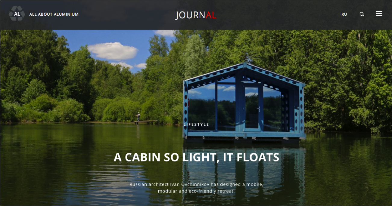
What is it? This primarily Russian site, owned and operated by the Russian company UC RUSAL (which ironically has a brutal website), pitches aluminium as a concept rather than any particular service they offer. There’s no hard sell, but rather multitudes of evidence that push aluminium as a go-to material for making homes, bikes, phones and anything else.
Why is their website great? The brand-agnostic attitude frees it up to be educational and informative without being boring. Essentially, this is a glossy digital magazine—all about aluminium.
How can you create something similar on a budget? Look beyond the smooth scrolling and comprehensive chemical breakdowns, and on their homepage you’ll find a masonry-style blog of posts chronicling the latest aluminium success stories. Yes, the site is sleek and contemporary, but it’s the content that sells the product. The blog is inbound marketing 101, with genuinely interesting articles, full-width images, embedded videos and more information than you could digest in a single sitting. Adopt a great inbound strategy yourself, then all you have to do is find a beautiful blog template and fill it with catchy content.
